/* TemplateMo 595 3d coverflow https://templatemo.com/tm-595-3d-coverflow */ @charset "utf-8"; /* CSS Document */ * { margin: 0; padding: 0; box-sizing: border-box; } html { scroll-behavior: smooth; } body { font-family: -apple-system, BlinkMacSystemFont, 'Segoe UI', Roboto, Helvetica, Arial, sans-serif; overflow-x: hidden; position: relative; background: #000; } /* Sections */ .section { min-height: 100vh; position: relative; display: flex; align-items: center; justify-content: center; } #home { background: radial-gradient(ellipse at center, #1a1a2e 0%, #0f0f0f 100%); } #about { background: linear-gradient(135deg, #0f0f0f 0%, #1a1a2e 100%); } #contact { background: radial-gradient(ellipse at center, #1a1a2e 0%, #0f0f0f 100%); } /* Header Styles */ .header { position: fixed; top: 0; left: 0; right: 0; height: 80px; background: rgba(0, 0, 0, 0.8); backdrop-filter: blur(10px); border-bottom: 1px solid rgba(255, 255, 255, 0.1); z-index: 1000; display: flex; align-items: center; justify-content: space-between; padding: 0 40px; transition: all 0.3s ease; } .header.scrolled { background: rgba(0, 0, 0, 0.95); height: 70px; } .logo-container { display: flex; align-items: center; gap: 12px; text-decoration: none; cursor: pointer; transition: transform 0.3s ease; } .logo-container:hover { transform: translateY(-2px); } .logo { width: 50px; height: 50px; display: flex; align-items: center; justify-content: center; } .logo svg { width: 100%; height: 100%; } .logo-text { color: white; font-size: 24px; font-weight: 600; letter-spacing: -0.5px; } .main-menu { display: flex; align-items: center; gap: 40px; } .menu-item { color: rgba(255, 255, 255, 0.8); text-decoration: none; font-size: 16px; font-weight: 500; transition: all 0.3s ease; position: relative; padding: 8px 0; } .menu-item:hover { color: white; transform: translateY(-2px); } .menu-item::after { content: ''; position: absolute; bottom: 0; left: 0; width: 0; height: 2px; background: linear-gradient(90deg, #667eea, #764ba2); transition: width 0.3s ease; } .menu-item:hover::after { width: 100%; } .menu-item.active { color: white; } .menu-item.active::after { width: 100%; } .menu-item.external::before { content: '↗'; margin-right: 5px; font-size: 12px; opacity: 0.7; } /* Mobile menu toggle */ .menu-toggle { display: none; flex-direction: column; cursor: pointer; padding: 4px; } .menu-toggle span { width: 25px; height: 3px; background: white; margin: 3px 0; transition: 0.3s; border-radius: 2px; } /* Home Section with Coverflow */ .coverflow-wrapper { width: 100%; height: 100vh; display: flex; align-items: center; justify-content: center; padding-top: 80px; } .coverflow-container { width: 100%; height: 100%; display: flex; align-items: center; justify-content: center; perspective: 1200px; position: relative; } .coverflow { display: flex; align-items: center; justify-content: center; transform-style: preserve-3d; position: relative; width: 100%; height: 400px; } .coverflow-item { position: absolute; width: 300px; height: 300px; transition: all 0.6s cubic-bezier(0.68, -0.55, 0.265, 1.55); cursor: pointer; user-select: none; } .coverflow-item .cover { width: 100%; height: 100%; border-radius: 10px; box-shadow: 0 20px 40px rgba(0, 0, 0, 0.8); position: relative; overflow: hidden; transform-style: preserve-3d; background: #333; } .coverflow-item .cover img { width: 100%; height: 100%; object-fit: cover; border-radius: 10px; } /* Reflection */ .coverflow-item .reflection { position: absolute; top: 100%; left: 0; width: 100%; height: 100%; border-radius: 10px; transform: scaleY(-1); opacity: 0.2; filter: blur(2px); background: linear-gradient(to bottom, rgba(0, 0, 0, 0) 0%, rgba(0, 0, 0, 0.8) 50%, rgba(0, 0, 0, 1) 100%); overflow: hidden; } /* Active item (center) */ .coverflow-item.active { z-index: 100; transform: translateX(0) translateZ(0) rotateY(0deg); } .coverflow-item.active .cover { box-shadow: 0 30px 60px rgba(0, 0, 0, 0.9); } /* Navigation */ .nav-button { position: absolute; top: 50%; transform: translateY(-50%); background: rgba(255, 255, 255, 0.1); border: 2px solid rgba(255, 255, 255, 0.2); color: white; width: 60px; height: 60px; border-radius: 50%; cursor: pointer; font-size: 24px; display: flex; align-items: center; justify-content: center; transition: all 0.3s ease; backdrop-filter: blur(10px); z-index: 200; } .nav-button:hover { background: rgba(255, 255, 255, 0.2); transform: translateY(-50%) scale(1.1); } .nav-button.prev { left: 50px; } .nav-button.next { right: 50px; } /* Dots indicator */ .dots-container { position: absolute; bottom: 60px; left: 50%; transform: translateX(-50%); display: flex; gap: 10px; z-index: 200; } .dot { width: 10px; height: 10px; border-radius: 50%; background: rgba(255, 255, 255, 0.3); cursor: pointer; transition: all 0.3s ease; } .dot.active { background: rgba(255, 255, 255, 0.8); transform: scale(1.3); } /* Info display */ .info { position: absolute; top: 120px; left: 50%; transform: translateX(-50%); color: white; text-align: center; z-index: 200; } .info h2 { font-size: 32px; margin-bottom: 10px; opacity: 0; animation: fadeIn 0.6s forwards; } .info p { font-size: 16px; opacity: 0.7; } @keyframes fadeIn { to { opacity: 1; } } /* Play/Pause Button */ .play-pause-button { position: absolute; bottom: 120px; left: 50%; transform: translateX(-50%); background: rgba(255, 255, 255, 0.1); border: 2px solid rgba(255, 255, 255, 0.2); color: white; width: 50px; height: 50px; border-radius: 50%; cursor: pointer; font-size: 20px; display: flex; align-items: center; justify-content: center; transition: all 0.3s ease; backdrop-filter: blur(10px); z-index: 200; } .play-pause-button:hover { background: rgba(255, 255, 255, 0.2); transform: translateX(-50%) scale(1.1); } .play-pause-button .pause-icon { font-size: 16px; letter-spacing: 2px; } /* About Section */ .about-content { max-width: 1400px; margin: 0 auto; padding: 40px; color: white; } .about-header { text-align: center; margin-bottom: 80px; } .about-header h2 { font-size: 48px; margin-top: 60px; margin-bottom: 20px; background: linear-gradient(135deg, #667eea 0%, #764ba2 100%); -webkit-background-clip: text; -webkit-text-fill-color: transparent; background-clip: text; } .about-header p { font-size: 20px; color: rgba(255, 255, 255, 0.8); max-width: 600px; margin: 0 auto; line-height: 1.8; } .about-main { display: grid; grid-template-columns: 1fr 1fr; gap: 80px; align-items: center; margin-bottom: 80px; } .about-visual { position: relative; height: 600px; display: flex; align-items: center; justify-content: center; } .showcase-display { position: relative; width: 100%; max-width: 500px; height: 500px; display: flex; align-items: center; justify-content: center; } .showcase-main { position: relative; width: 350px; height: 400px; background: linear-gradient(135deg, rgba(102, 126, 234, 0.1) 0%, rgba(118, 75, 162, 0.1) 100%); border-radius: 30px; border: 2px solid rgba(255, 255, 255, 0.1); padding: 40px; display: flex; flex-direction: column; align-items: center; justify-content: center; backdrop-filter: blur(10px); box-shadow: 0 25px 50px rgba(0, 0, 0, 0.3); } .showcase-logo { width: 120px; height: 120px; background: linear-gradient(135deg, #667eea 0%, #764ba2 100%); border-radius: 30px; display: flex; align-items: center; justify-content: center; margin-bottom: 30px; box-shadow: 0 15px 35px rgba(102, 126, 234, 0.4); } .showcase-logo svg { width: 70%; height: 70%; } .showcase-title { font-size: 32px; font-weight: 700; color: white; margin-bottom: 15px; text-align: center; } .showcase-subtitle { font-size: 16px; color: rgba(255, 255, 255, 0.7); text-align: center; margin-bottom: 40px; line-height: 1.6; } .showcase-badges { display: flex; gap: 15px; flex-wrap: wrap; justify-content: center; } .badge { background: rgba(255, 255, 255, 0.05); border: 1px solid rgba(255, 255, 255, 0.2); border-radius: 20px; padding: 8px 16px; font-size: 14px; color: rgba(255, 255, 255, 0.8); backdrop-filter: blur(10px); transition: all 0.3s ease; cursor: pointer; text-decoration: none; display: inline-block; } .badge:hover { background: linear-gradient(135deg, #667eea 0%, #764ba2 100%); border-color: transparent; color: white; transform: translateY(-2px); box-shadow: 0 5px 15px rgba(102, 126, 234, 0.3); } .badge:active { transform: translateY(0); box-shadow: 0 2px 8px rgba(102, 126, 234, 0.3); } /* Decorative corner elements */ .corner-decoration { position: absolute; width: 80px; height: 80px; border: 2px solid rgba(102, 126, 234, 0.3); } .corner-decoration.top-left { top: -20px; left: -20px; border-right: none; border-bottom: none; border-radius: 20px 0 0 0; } .corner-decoration.bottom-right { bottom: -20px; right: -20px; border-left: none; border-top: none; border-radius: 0 0 20px 0; } .about-info { padding-left: 40px; } .about-info h3 { font-size: 36px; margin-bottom: 30px; line-height: 1.3; } .about-info p { font-size: 18px; color: rgba(255, 255, 255, 0.8); line-height: 1.8; margin-bottom: 30px; } .feature-list { list-style: none; margin-bottom: 40px; } .feature-list li { display: flex; align-items: center; gap: 15px; margin-bottom: 20px; font-size: 16px; color: rgba(255, 255, 255, 0.9); } .feature-list li::before { content: '✓'; display: flex; align-items: center; justify-content: center; width: 30px; height: 30px; background: linear-gradient(135deg, #667eea 0%, #764ba2 100%); border-radius: 50%; flex-shrink: 0; } .cta-button { display: inline-flex; align-items: center; gap: 10px; background: linear-gradient(135deg, #667eea 0%, #764ba2 100%); color: white; text-decoration: none; padding: 15px 30px; border-radius: 30px; font-weight: 600; transition: all 0.3s ease; } .cta-button:hover { transform: translateY(-2px); box-shadow: 0 10px 30px rgba(102, 126, 234, 0.5); } .cta-button svg { width: 20px; height: 20px; transition: transform 0.3s ease; } .cta-button:hover svg { transform: translateX(5px); } .stats-section { display: grid; grid-template-columns: repeat(4, 1fr); gap: 40px; padding: 60px; background: rgba(255, 255, 255, 0.03); backdrop-filter: blur(10px); border-radius: 30px; border: 1px solid rgba(255, 255, 255, 0.1); } .stat-item { text-align: center; } .stat-number { font-size: 48px; font-weight: 700; background: linear-gradient(135deg, #667eea 0%, #764ba2 100%); -webkit-background-clip: text; -webkit-text-fill-color: transparent; background-clip: text; margin-bottom: 10px; } .stat-label { font-size: 16px; color: rgba(255, 255, 255, 0.7); } /* Contact Section */ .contact-content { max-width: 1200px; margin: 0 auto; padding: 40px; color: white; } .contact-header { text-align: center; margin-top: 60px; margin-bottom: 60px; } .contact-header h2 { font-size: 48px; margin-bottom: 20px; background: linear-gradient(135deg, #667eea 0%, #764ba2 100%); -webkit-background-clip: text; -webkit-text-fill-color: transparent; background-clip: text; } .contact-header p { font-size: 20px; color: rgba(255, 255, 255, 0.8); max-width: 600px; margin: 0 auto; } .contact-container { display: grid; grid-template-columns: 1fr 1fr; gap: 60px; align-items: start; } .contact-info-section { padding-right: 40px; } .contact-info-section h3 { font-size: 28px; margin-bottom: 20px; color: white; } .contact-info-section p { font-size: 16px; color: rgba(255, 255, 255, 0.7); line-height: 1.8; margin-bottom: 40px; } .contact-details { display: flex; flex-direction: column; gap: 25px; } .contact-item { display: flex; align-items: center; gap: 20px; padding: 20px; background: rgba(255, 255, 255, 0.05); backdrop-filter: blur(10px); border: 1px solid rgba(255, 255, 255, 0.1); border-radius: 15px; transition: all 0.3s ease; } .contact-item:hover { background: rgba(255, 255, 255, 0.08); transform: translateX(5px); box-shadow: 0 10px 30px rgba(102, 126, 234, 0.2); } .contact-icon { width: 50px; height: 50px; background: linear-gradient(135deg, #667eea 0%, #764ba2 100%); border-radius: 12px; display: flex; align-items: center; justify-content: center; flex-shrink: 0; } .contact-icon svg { width: 24px; height: 24px; fill: white; } .contact-text { flex: 1; } .contact-text h4 { font-size: 16px; color: white; margin-bottom: 5px; } .contact-text p { font-size: 14px; color: rgba(255, 255, 255, 0.7); margin: 0; } .social-links { margin-top: 40px; } .social-links h4 { font-size: 18px; margin-bottom: 20px; color: white; } .social-buttons { display: flex; gap: 15px; } .social-btn { width: 45px; height: 45px; background: rgba(255, 255, 255, 0.05); border: 1px solid rgba(255, 255, 255, 0.2); border-radius: 50%; display: flex; align-items: center; justify-content: center; transition: all 0.3s ease; cursor: pointer; } .social-btn:hover { background: linear-gradient(135deg, #667eea 0%, #764ba2 100%); border-color: transparent; transform: translateY(-3px); box-shadow: 0 10px 20px rgba(102, 126, 234, 0.4); } .social-btn svg { width: 20px; height: 20px; fill: white; } .contact-form-section { padding-left: 40px; } .contact-form { background: rgba(255, 255, 255, 0.03); backdrop-filter: blur(10px); border: 1px solid rgba(255, 255, 255, 0.1); border-radius: 20px; padding: 40px; } .form-group { margin-bottom: 25px; } .form-group label { display: block; margin-bottom: 10px; color: rgba(255, 255, 255, 0.8); font-weight: 500; } .form-group input, .form-group textarea { width: 100%; padding: 15px; background: rgba(255, 255, 255, 0.05); border: 1px solid rgba(255, 255, 255, 0.2); border-radius: 10px; color: white; font-size: 16px; font-family: inherit; transition: all 0.3s ease; } .form-group input:focus, .form-group textarea:focus { outline: none; border-color: #667eea; background: rgba(255, 255, 255, 0.08); } .form-group textarea { resize: vertical; min-height: 150px; line-height: 1.5; } .submit-btn { background: linear-gradient(135deg, #667eea 0%, #764ba2 100%); color: white; border: none; padding: 15px 40px; font-size: 18px; font-weight: 600; border-radius: 30px; cursor: pointer; transition: all 0.3s ease; width: 100%; } .submit-btn:hover { transform: translateY(-2px); box-shadow: 0 10px 30px rgba(102, 126, 234, 0.5); } /* Smooth image loading */ .image-loading { background: linear-gradient(45deg, #333, #555); position: relative; } .image-loading::after { content: '📷'; position: absolute; top: 50%; left: 50%; transform: translate(-50%, -50%); font-size: 48px; opacity: 0.5; } /* Footer Styles */ .footer { background: rgba(0, 0, 0, 0.95); border-top: 1px solid rgba(255, 255, 255, 0.1); padding: 40px 20px; margin-top: 80px; } .footer-content { max-width: 1200px; margin: 0 auto; display: flex; justify-content: space-between; align-items: center; flex-wrap: wrap; gap: 30px; } .footer-copyright { color: rgba(255, 255, 255, 0.6); font-size: 14px; } .footer-copyright a { color: #667eea; text-decoration: none; transition: color 0.3s ease; } .footer-copyright a:hover { color: #764ba2; } .footer-links { display: flex; gap: 30px; align-items: center; } .footer-links a { color: rgba(255, 255, 255, 0.7); text-decoration: none; font-size: 14px; transition: color 0.3s ease; } .footer-links a:hover { color: white; } /* Scroll to top button */ .scroll-to-top { position: fixed; bottom: 30px; right: 30px; width: 50px; height: 50px; background: linear-gradient(135deg, #667eea 0%, #764ba2 100%); border-radius: 50%; display: flex; align-items: center; justify-content: center; color: white; font-size: 20px; cursor: pointer; opacity: 0; transform: translateY(100px); transition: all 0.3s ease; z-index: 999; } .scroll-to-top.visible { opacity: 1; transform: translateY(0); } .scroll-to-top:hover { transform: translateY(-5px); box-shadow: 0 10px 30px rgba(102, 126, 234, 0.5); } /* Mobile Responsive */ @media (max-width: 1024px) { .about-main { grid-template-columns: 1fr; gap: 60px; } .about-visual { height: 400px; } .about-info { padding-left: 0; text-align: center; } .feature-list { text-align: left; max-width: 500px; margin: 0 auto 40px; } .stats-section { grid-template-columns: repeat(2, 1fr); gap: 30px; padding: 40px; } /* Contact section responsive */ .contact-container { grid-template-columns: 1fr; gap: 50px; } .contact-info-section { padding-right: 0; } .contact-form-section { padding-left: 0; } } @media (max-width: 768px) { .header { padding: 0 20px; } .main-menu { display: none; position: absolute; top: 100%; left: 0; right: 0; background: rgba(0, 0, 0, 0.95); backdrop-filter: blur(10px); flex-direction: column; padding: 20px; gap: 20px; border-bottom: 1px solid rgba(255, 255, 255, 0.1); } .main-menu.active { display: flex; } .menu-toggle { display: flex; } .menu-toggle.active span:nth-child(1) { transform: rotate(-45deg) translate(-5px, 6px); } .menu-toggle.active span:nth-child(2) { opacity: 0; } .menu-toggle.active span:nth-child(3) { transform: rotate(45deg) translate(-5px, -6px); } .coverflow-item { width: 200px; height: 200px; } .nav-button { width: 40px; height: 40px; font-size: 18px; } .nav-button.prev { left: 20px; } .nav-button.next { right: 20px; } .info h2 { font-size: 24px; } .info p { font-size: 14px; } .logo-text { font-size: 20px; } .about-header h2 { font-size: 36px; } .about-info h3 { font-size: 28px; } .about-visual { height: 400px; } .showcase-display { max-width: 350px; height: 400px; } .showcase-main { width: 100%; height: 350px; padding: 30px; } .showcase-logo { width: 100px; height: 100px; margin-bottom: 20px; } .showcase-title { font-size: 28px; } .showcase-subtitle { font-size: 14px; margin-bottom: 30px; } .corner-decoration { display: none; } .stat-number { font-size: 36px; } .contact-content h2 { font-size: 36px; } .footer-content { flex-direction: column; text-align: center; gap: 20px; } .footer-links { gap: 20px; } } @media (max-width: 480px) { .header { height: 70px; padding: 0 15px; } .header.scrolled { height: 60px; } .logo { width: 40px; height: 40px; } .logo-text { font-size: 18px; } .coverflow-item { width: 180px; height: 180px; } .about-content, .contact-content { padding: 20px; } /* Additional contact section mobile optimization for small screens */ .contact-container { gap: 30px; } .contact-header { margin-bottom: 40px; } .contact-header h2 { font-size: 32px; margin-bottom: 15px; } .contact-header p { font-size: 16px; padding: 0 10px; } .contact-info-section { margin-bottom: 20px; } .contact-info-section h3 { font-size: 22px; margin-bottom: 15px; } .contact-info-section > p { font-size: 14px; padding: 0 10px; margin-bottom: 30px; } .contact-details { gap: 15px; } .contact-item { padding: 15px; gap: 12px; } .contact-icon { width: 40px; height: 40px; } .contact-icon svg { width: 20px; height: 20px; } .contact-text h4 { font-size: 14px; } .contact-text p { font-size: 12px; word-break: break-word; } .social-links { margin-top: 30px; } .social-links h4 { font-size: 16px; margin-bottom: 15px; } .social-buttons { gap: 10px; } .social-btn { width: 40px; height: 40px; } .social-btn svg { width: 18px; height: 18px; } .contact-form { padding: 20px 15px; border-radius: 15px; } .form-group { margin-bottom: 20px; } .form-group label { font-size: 14px; margin-bottom: 8px; } .form-group input, .form-group textarea { padding: 12px; font-size: 14px; border-radius: 8px; } .form-group textarea { min-height: 120px; } .submit-btn { padding: 12px 30px; font-size: 16px; border-radius: 25px; } }
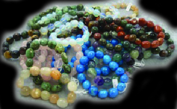
Everything You Long For in a Metaphysical Store and More!
A revolutionary way to showcase your visual content with stunning 3D effects and seamless interactions
Transform your image galleries into immersive 3D experiences
3D Coverflow is brought to you by TemplateMo. Transform the way you present images with our cutting-edge 3D coverflow technology. Create immersive, interactive galleries that captivate your audience and leave a lasting impression.
Whether you're showcasing portfolio pieces, product images, or creating an interactive story, our 3D coverflow brings your content to life with fluid animations and intuitive controls.
Have a project in mind? Let's create something amazing together.
We're here to help bring your vision to life. Whether you need a stunning gallery, a complete website redesign, or custom development work, we'd love to hear from you.
hello@3dcoverflow.com
+1 (555) 123-4567
123 Design Street, San Francisco, CA 94102
Monday - Friday: 9:00 AM - 6:00 PM PST